Category Archives: Research and Teaching Tools

Rapid Development for the History Web

This year I was privileged to design and teach an experimental (and somewhat improvisational) course spanning multiple disciplines. It is one of a small number of Digital History courses offered at the undergraduate level in the United States and, to the best of my knowledge, the only course of its kind to require students to conceive, design, and execute an original historical website in a matter of weeks. Beginning with a short overview of the history of computing, the major part of the course deals with current debates and problems confronting historians in the Digital Age. Students read theoretical literature on topics such as the gender divide, big data, and the democratization of knowledge, as well as digital history projects spanning the range of human experience, from ancient Greece to modern Harlem. Guest speakers discussed the complexities of database design and the legal terrain of fair use, open access, and privacy. The complete syllabus is available here.

Unusually for a humanities class, the students engaged in a series of labs to build and test digital literacy skills. This culminated in a final project asking them to select, organize, and interpret a body of original source material. I solicited ideas and general areas of interest for the project and posted a list to the class blog that grew over the course of the semester. Students expressed interest in newspaper databases, amateur history and genealogy, text mining and topic modeling, local community initiatives, and communications, culture, and new media. I thought it was important to find a project that would speak to every student’s interest while not playing favorites with the subject matter. We considered a plan to scan and present an archive of old student and university publications. I thought it was a good idea. On the other hand, it would have involved at lot of time-consuming rote digitization, access to restricted library collections, and sharing of limited scanning facilities.

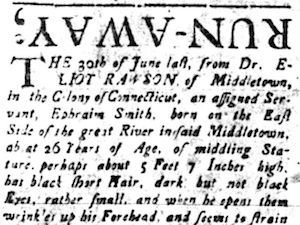
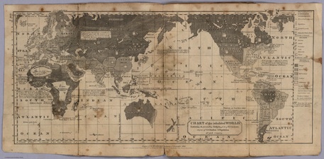
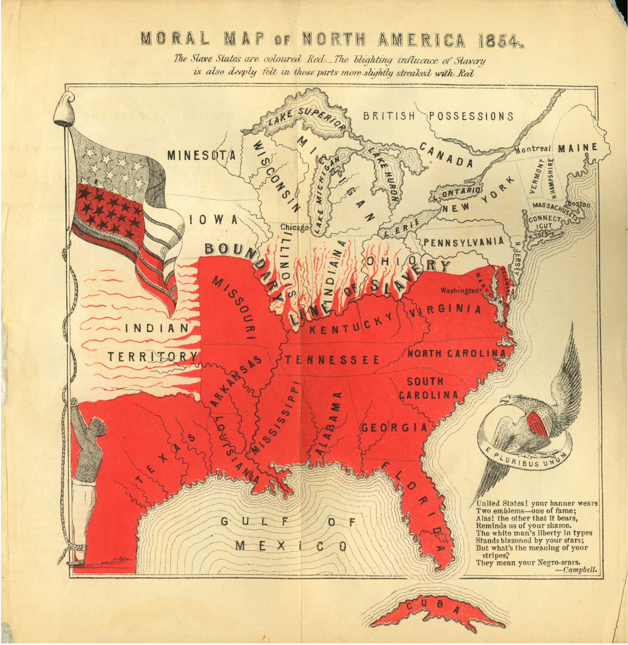
Ultimately, the students decided to build an interactive database of runaway advertisements printed in colonial and early national Connecticut. This seemed to satisfy every major area of interest on our list and, when I polled the class, there was broad consensus that it would be an interesting experiment. The project grew out of an earlier assignment, which asked students to review websites pertaining to the history of slavery and abolition. It also allowed me to draw on my academic background researching and teaching about runaways. We settled on Connecticut because it is a relatively small state with a small population, as well as home to the nation’s oldest continuously published newspaper. At the same time, it was an important colonial outpost and deeply involved in the slave trade and other forms of unfree labor on a variety of fronts.

RunawayCT_projectDrawing on the site reviews submitted earlier in the term, we brainstormed some ideas for what features would and would not work on our site. The students were huge fans of Historypin, universally acclaimed for both content and interface. So we quickly agreed that the site should have a strong geospatial component. We also agreed that the site should have a focus on accessibility for use in classrooms and by researchers as well as the general public. Reading about History Harvest, OutHistory.org, and other crowdsourced community heritage projects instilled a desire to reach out to and collaborate with local educators. Settling on a feasible research methodology was an ongoing process. Although initially focused on runaway slaves, I gently encouraged a broader context. Thus the final site presents ads for runaway children, servants, slaves, soldiers, wives, and prisoners and ties these previously disparate stories into a larger framework. Finally, a student who had some experience with web design helped us to map a work plan for the project based on the Web Style Guide by Patrick Lynch and Sarah Horton.

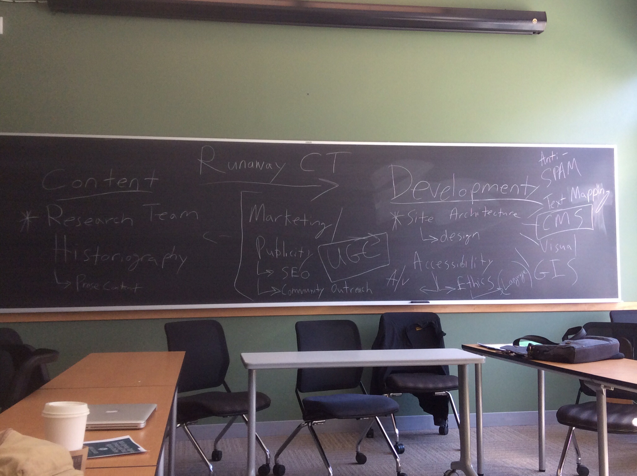
Since there were students from at least half a dozen different majors, with vastly different interests and skill sets, we needed a way to level the playing field, and specialized work groups seemed like a good way to do this. We sketched out the groups together in class and came up with four: Content, CMS, Outreach, and Accessibility. The Content Team researched the historiography on the topic and wrote most of the prose content, including the transcriptions of the advertisements. They used Readex’s America’s Historical Newspapers database to mine for content and collated the resulting data using shared Google Docs. The CMS Team, composed mostly of computer science majors, focused on building the framework and visual feel for the site. Theoretically they could have chosen any content management system, although I pushed for Omeka and Neatline as probably the best platforms for what we needed to do. The Outreach Team created a twitter feed and a video documentary and solicited input about the site from a wide range of scholars and other professionals. The Accessibility Officer did extensive research and testing to make sure the site was fully compliant with open web standards and licenses.

The group structure had benefits and drawbacks. I tried to keep the system as flexible as possible. I insisted that major decisions be made by consensus and that group members post periodic updates to the class blog so that we could track our progress. Some students really liked it and floated around between different groups, helping out as necessary. I also received criticism on my evaluations from students who felt boxed in and complained that there was too much chaos and not enough communication between the groups. So I will probably rethink this approach in the future. One evaluator suggested that I ditch the collaborative project altogether and ask each student to create their own separate site, but that seems even more chaotic. In my experience, there are always students who want less group work and students who want more, and it is an ongoing struggle to find the right balance for a given class.

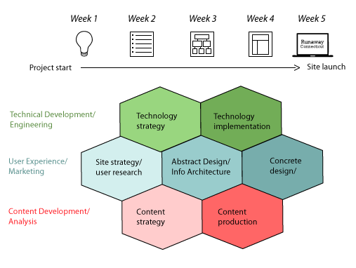
The assignment to design and publish an original historical site in a short amount of time, with no budget, almost no outside support, and only a general sense of what needs to be done is essentially a smaller, limited form of crowdsourcing. More accurately, it is a form of rapid development, in which the transition between design and production is extremely fast and highly mutable. Rapid development has been a mainstay of the technology industry for a while now. In my class, I cited the example of One Week | One Tool, in which a small group of really smart people get together and produce an original digital humanities tool. If they could do that over the course of a single week, I asked, what could an entire class of really smart people accomplish in a month?

The result, RunawayCT.org, is not anything fancy, but it is an interesting proof of concept. Because of the hit-or-miss nature of OCR on very old, poorly microfilmed newspapers, we could not get a scientific sample of advertisements. Figuring out how to properly select, categorize, format, and transcribe the data was no mean feat – although these are exactly the kinds of problems that scholarly history projects must confront on a daily basis. The Outreach Team communicated with the Readex Corporation throughout the project, and their representatives were impressively responsive and supportive of our use of their newspaper database. When the students asked Readex for access to their internal API so that we could automate our collection of advertisements, they politely declined. Eventually, I realized that there were literally thousands of ads, only a fraction of which are easily identified with search terms. So our selection of ads was impressionistic, with some emphasis on chronological breadth and on ads that were especially compelling to us.

upside downDespite the students’ high level of interest in, even fascination with, the content of the ads, transcribing them could be tedious work. I attempted to apply OCR to the ad images using ABBYY FineReader and even digitized some newspaper microfilm reels to create high resolution copies, but the combination of eighteenth-century script and ancient, blurry microfilm rendered OCR essentially useless. Ads printed upside down, faded ink, and text disappearing into the gutters between pages were only a few of the problems with automatic recognition. At some point toward the end, I realized that my Mac has a pretty badass speech-to-text utility built into the OS. So I turned it on, selected the UK English vocabulary for the colonial period ads, and plugged in an old Rock Band mic (which doubles as an external USB microphone). Reading these ads, which are almost universally offensive, aloud in my room was a surreal experience. It was like reading out portions of Mein Kampf or Crania Americana, and it added a new materiality and gravity to the text. I briefly considered adding an audio component to the site, but after thinking about it for a while, in the cold light of day, I decided that it would be too creepy. One of my students pointed out that a popular educational site on runaway slaves is accompanied by the sounds of dogs barking and panicked splashing through rivers. And issues like these prompted discussion about what forms of public presentation would be appropriate for our project.

I purposely absented myself from the site design because I wanted the students to direct the project and gain the experience for themselves. On the other hand, if I had inserted myself more aggressively, things might have moved along at a faster pace. Ideas such as building a comprehensive data set, or sophisticated topic modelling, or inviting the public to participate in transcribing and commenting upon the documents, had to be tabled for want of time. Although we collected some historical maps of Connecticut and used them to a limited extent, we did not have the opportunity to georeference and import them into Neatline. This was one of my highest hopes for the project, and I may still attempt to do it at some point in the future. I did return to the site recently to add a rudimentary timeline to our exhibit. Geocoding took only minutes using an API and some high school geometry, so I assumed the timeline would be just as quick. Boy, was I wrong. To accomplish what I needed, I had to learn some MySQL tricks and hack the underlying database. I also had to make significant alterations to our site theme to get everything to display correctly.

One of the biggest challenges we faced as a class was securing a viable workspace for the project. Technology Services wanted us to use their institutional Omeka site, with little or no ability to customize anything, and balked at the notion of giving students shell access to their own server space. Instead, they directed us to Amazon Web Services, which was a fine compromise, but caused delays getting our system in place and will create preservation issues in the future. As it is now, the site will expire in less than a year, and when I asked, there was little interest in continuing to pay for the domain. I was told saving the site would be contingent on whether or not it is used in other classes and whether it “receives decent traffic.” (Believe it or not, that’s a direct quote.) One wonders how much traffic most student projects receive and what relationship that should bear to their institutional support.

Although not a finely polished gem, RunawayCT.org demonstrates something of the potential of rapid development for digital history projects. As of right now, the site includes almost 600 unique ads covering over half a century of local history. At the very least, it has established a framework for future experimentation with runaway ads and other related content. Several of the students told me they were thrilled to submit a final project that would endure and be useful to the broader world, rather than a hastily-written term paper that will sit in a filing cabinet, read only by a censorious professor. Given all that we accomplished in such a short time span, I can only guess what could be done with a higher level of support, such as that provided by the NEH or similar institutions. My imagination is running away with the possibilities.

Cross-posted at HASTAC

History Leaks

I am involved in a new project called History Leaks. The purpose of the site is to publish historically significant public domain documents and commentaries that are not available elsewhere on the open web. The basic idea is that historians and others often digitize vast amounts of information that remains locked away in their personal files. Sharing just a small portion of this information helps to increase access and draw attention to otherwise unknown or underappreciated material. It also supports the critically important work of archives and repositories at a time when these institutions face arbitrary cutbacks and other challenges to their democratic mission.

I hope that you will take a moment to explore the site and that you will check back often as it takes shape, grows, and develops. Spread the word to friends and colleagues. Contributions are warmly welcomed and encouraged. Any feedback, suggestions, or advice would also be of value. A more detailed statement of purpose is available here.

Combine JPEGs and PDFs with Automator

leninchristmasLike most digital historians, my personal computer is packed to the gills with thousands upon thousands of documents in myriad formats and containers: JPEG, PDF, PNG, GIF, TIFF, DOC, DOCX, TXT, RTF, EPUB, MOBI, AVI, MP3, MP4, XLSX, CSV, HTML, XML, PHP, DMG, TAR, BIN, ZIP, OGG. Well, you get the idea. The folder for my dissertation alone contains almost 100,000 discrete files. As I mentioned last year, managing and preserving all of this data can be somewhat unwieldy. One solution to this dilemma is to do our work collaboratively on the open web. My esteemed colleague and fellow digital historian Caleb McDaniel is running a neat experiment in which he and his student assistants publish all of their research notes, primary documents, drafts, presentations, and other material online in a wiki.

Although I think there is a great deal of potential in projects like these, most of us remain hopelessly mired in virtual reams of data files spread across multiple directories and devices. A common issue is a folder with 200 JPEGs from some archival box or a folder with 1,000 PDFs from a microfilm scanner. One of my regular scholarly chores is to experiment with different ways to sort, tag, manipulate, and combine these files. This time around, I would like to focus on a potential solution for the latter task. So if, like most people, you have been itching for a way to compile your entire communist Christmas card collection into a single handy document, today is your lucky day. Now you can finally finish that article on why no one ever invited Stalin over to their house during the holidays.

Combining small numbers of image files or PDFs into larger, multipage PDFs is a relatively simply point-and-click operation using Preview (for Macs) or Adobe Acrobat. But larger, more complex operations can become annoying and repetitive pretty quickly. Since I began my IT career on Linux and since my Mac runs on a similar Unix core, I tend to fall back on shell scripting for exceptionally complicated operations. The venerable, if somewhat bloated, PDFtk suite is a popular choice for the programming historian, but there are plenty of other options as well. I’ve found the pdfsplit and pdfcat tools included in the latter package to be especially valuable. At the same time, I’ve been trying to use the Mac OS X Automator more often, and I’ve found that it offers what is arguably an easier, more user friendly interface, especially for folks who may be a bit more hesitant about shell scripting.

What follows is an Automator workflow that takes an input folder of JPEGs (or PDFs) and outputs a single combined PDF with the same name as the containing folder. It can be saved as a service, so you can simply right-click any folder and run the operation within the Mac Finder. I’ve used this workflow to combine thousands of research documents into searchable digests.

Step 1: Open Automator, create a new workflow and select the “Service” template. At the top right, set it to receive selected folders in the Finder.

Step 2: Insert the “Set Value of Variable” action from the library of actions on the left. Call the variable “Input.” Below this, add a “Run Applescript” action and paste in the following commands:

on run {input}
tell application "Finder"
set FilePath to (container of (first item of input)) as alias
end tell
return FilePath
end run

Add another “Set Value of Variable” action below this and call it “Path.” This will establish the absolute path to the containing folder of your target folder for use later in the script. If this is all getting too confusing, just hang it there. It will probably make more sense by the end.

combinesmallStep 3: Add a “Get Value of Variable” action and set it to “Input.” Click on “Options” on the bottom of the action and select “Ignore this action’s input.” This part is crucial, as you are starting a new stage of the process.

Step 4: Add the “Run Shell Script” action. Set the shell to Bash and pass input “as arguments.” Then paste the following code:

echo ${1##*/}

I admit that I am cheating a little bit here. This Bash command will retrieve the title of the target folder so that your output file is named properly. There is probably an easier way to do this using Applescript, but to be honest I’m just not that well versed in Applescript. Add another “Set Value of Variable” action below the shell script and call it “FolderName” or whatever else you want to call the variable – it really doesn’t matter.

Step 5: Add another “Get Value of Variable” action and set it to “Input.” Click on “Options” on the bottom of the action and select “Ignore this action’s input.” Once again, this step is crucial, as you are starting a new stage of the process.

Step 6: Add the action to “Get Folder Contents,” followed by the action to “Sort Finder Items.” Set the latter to sort by name in ascending order. This will assure that the pages of your output PDF are in the correct order, the same order in which they appeared in the source folder.

Step 7: Add the “New PDF from Images” action. This is where the actual parsing of the JPEGs will take place. Save the output to the “Path” variable. If you don’t see this option on the list, go to the top menu and click on View –> Variables. You should now see a list of variables at the bottom of the screen. At this point, you can simply drag and drop the “Path” variable into the output box. Set the output file name to something arbitrary like “combined.” If you want to combine individual PDF files instead of images, skip this step and scroll down to the end of this list for alternative instructions.

Step 8: Add the “Rename Finder Items” action and select “Replace Text.” Set it to find “combined” in the basename and replace it with the “FolderName” variable. Once again, you can drag and drop the appropriate variable from the list at the bottom of the screen. Save the workflow as something obvious like “Combine Images into PDF,” and you’re all set. When you right-click on a folder of JPEGs (or other images) in the Finder, you should be able to select your service. Try it out on some test folders with a small number of images to make sure all is working properly. The workflow should deposit your properly-named output PDF in the same directory as the source folder.

To combine PDFs rather than image files, follow steps 1-6 above. After retrieving and sorting the folder contents, add the “Combine PDF Pages” action and set it to combine documents by appending pages. Next add an action to “Rename Finder Items” and select “Name Single Item” from the pull-down menu. Set it to name the “Basename only” and drag and drop the “FolderName” variable into the text box. Lastly, add the “Move Finder Items” action and set the location to the “Path” variable. Save the service with a name like “Combine PDFs” and you’re done.

This procedure can be modified relatively easily to parse individually-selected files rather than entire folders. A folder action worked best for me, though, so that’s what I did. Needless to say, the containing folder has to be labeled appropriately for this to work. I find that I’m much better at properly naming my research folders than I am at naming all of the individual files within them. So, again, this process worked best for me. A lot can go wrong with this workflow. Automator can be fickle, and scripting protocols are always being updated and revised, so I disavow any liability for your personal filesystem. I also welcome any comments or suggestions to improve or modify this process.

WordPress as a Course Management System

I am a big fan of the WordPress publishing platform. It’s robust and intuitive with an elegant user interface, and best of all, it’s completely open source. Content management heavyweights such as Drupal or MediaWiki may be better equipped when it comes to highly complex, multimodal databases or custom scripting, but for small-scale, quick and dirty web publishing, I can think of few rivals to the WordPress dynasty. About 20% of all websites currently run on some form of WordPress. Considering that Google’s popular Blogger platform accounts for a measly 1.2% of the total, this is a staggering statistic. Like many digital humanists, I use WordPress for my personal blogging as well as for the courses that I teach. Yet I often wonder if I am using this wonderfully diverse free software to its full potential. Instead of an experimental sideshow or an incidental component of a larger course, what if I made digital publishing the core element, the central component of my research and teaching?

Jack Black as a course management system

What follows are my suggestions for using a WordPress blog as a full-fledged course management system for a small discussion seminar. These days almost all colleges and universities have a centralized course management system of some sort. In the dark ages of IT, a proprietary and much-derided software package called Blackboard dominated the landscape. More recently, there is the free and open source Moodle, the Sakai Project, and many others (Yale uses a custom rendition of Sakai called Classes*v2). These platforms, sometimes called learning management systems, collaboration and learning environments, or virtual learning environments, are typically quite powerful. Historically, they have played an important role in bridging analog and digital pedagogy. Compared to WordPress, however, they can seem arcane and downright unfriendly. Although studies of course management systems are sporadic and anecdotal, one of the most common complaints is “the need for a better user interface.” Such systems are built around administrative imperatives, such as quizzing, grading, and paper submission, that either subvert or stifle creative pedagogy. Instead of working to improve these old methods, perhaps it is time to embrace a new paradigm. Why waste time training students and teachers on idiosyncratic in-house systems, based on rote administrative functions, when you can give them more valuable experience on a major web publishing platform? Why let technology determine the limits of our scholarship and teaching, when we can use our scholarship and teaching to push the boundaries of emerging technologies?

Before getting started, I should point out that there are already a wide variety of plugins that aim to transform WordPress into a more robust collaborative learning tool. Sensei and BuddyPress Courseware are good examples. The ScholarPress project was an early innovator and still shows great promise, but it has not been updated in several years and no longer works with the latest versions of WordPress. The majority of these systems are more appropriate for large lectures, distance learning, or MOOCs (massive open online courses). There is no one-size-fits-all approach. For smaller seminars and discussion sections, however, a custom assortment of plugins and settings is usually all that is required. I have benefited from previous conversations about this topic. I also collaborate closely with my colleagues at Yale’s Instructional Technology Group when designing a new course. It is worth repeating that the digital humanities are, at their heart, a community enterprise.

Step 1: Install WordPress. An increasing number of colleges and universities offer custom course blogs along with different levels of IT support. For faculty and students here, Yale Academic Commons serves as a one-stop-shop for scholarly web publishing. Other options include building your own WordPress site or signing up for free hosting.

Step 2: Find a good theme. There is an endless sea of WordPress themes out there, many of them free. For my course blogs, I prefer something that is both minimalist and intuitive, like the best academic blogs. The simpler the better. I also spend a lot of time choosing and editing an appropriate and provocative banner image. This will be the first thing that your students see every time they log in to the site, and it should reflect some of the central themes or problems of your course. It should be something worth pondering. Write a bit about the significance of the banner on the “About” page or as a separate blog post, but do not clutter your site with media. As Dan Cohen pointed out last year, effective design is all about foregrounding the content.

Step 3: Load up on plugins. Andrew Cullison provides a good list of course management plugins for WordPress. Although almost all of them are out of date now, many have newer counterparts that are easily discoverable in the official WordPress plugin directory. Among the more useful plugins are those that allow you to embed interactive polls, create tag clouds, sync calendars, and selectively hide sensitive content. ShareThis offers decent social media integration. WPtouch is a great way to streamline your site for mobile devices. Footnote and annotation plugins are helpful for posting and workshopping assignments. I also recommend typography plugins to do fancy things like pull quotes and drop caps. A well configured WYSIWYG editor, such as TinyMCE, is essential.

Step 4: Upload content. Post an interactive version of the syllabus, links to the course readings, films, image galleries, and any other pertinent data. Although your institution probably has a centralized reserves system, it is perfectly legal to post short reading assignments directly to your course site, as long as they are only available to registered students. In some cases, this might actually be preferable to library reserves that jumble all of your documents together with missing endnotes and abstruse titles. Most WordPress installs do not have massive amounts of media storage space, but there is usually enough for a modest amount of data. If you need more room, use Google Drive or a similar cloud storage service.

Step 5: Configure settings and metadata. Make sure your students are assigned the proper user roles when they are added to the blog. Also be sure to establish a semantic infrastructure, with content categories for announcements, news, reading responses, primary documents, project prospectuses, etc. Your WYSIWYG editor should be configured so that both you and your students can easily embed YouTube videos, cite sources, and create tables. Depending on the level of interaction you would like to encourage on your site, the discussion settings are worth going over carefully.

Step 6: Figure out how you’re going to grade. After a good deal of experimentation, I settled on a plugin called Grader. It allows instructors to post comments that are viewable only to them and the student. Check out Mark Sample’s rubric for evaluating student blogs. Rather than grade each individual post, I prefer to evaluate work in aggregate at certain points during the semester. I also tend to prefer the 0-100 or A-F scale to the alternatives. Providing substantial feedback on blog posts is probably better than the classic √ or √+. You should treat each post as a miniature essay and award extra points for creativity, interactivity, and careful deliberation. If you are serious about digital publishing, it should account for at least 30-50% of the final grade for the course. Although I have not experimented with them yet, there are gradebook plugins that purport to allow students to track their progress throughout the semester.

Step 7: Be clear about your expectations. It can be difficult to strike the correct balance between transparency and simplicity, but I usually prefer to spell out exactly what I want from my students. For a course blog, that probably means posting regular reading responses and commentaries. In addition to response papers, primary documents, and bibliographies, I ask students to post recent news items and events pertaining to the central themes of the course. I encourage them to embed relevant images, films, and documents and to link to both internal and external material. I also require students to properly title, categorize, and tag their posts. Because what good is a blog if you are not making full use of the medium?

Step 8: Publish. Although there are good reasons for keeping course blogs behind an institutional firewall, there are equally good reasons for publishing them to the world. An open blog encourages students to put their best foot forward, teaches them to speak to a broader audience, and leaves a lasting record of their collective efforts. If making your blog publicly accessible, allow your students to post using just their first names or a pseudonym. This will allow them to remain recognizable to class members but relatively anonymous to the rest of the world. It is also a good idea to restrict access to certain pages and posts, such as the course readings and gradebook, to comply with FERPA and Fair Use guidelines.

I always review my course blogs on the first day of class, and I spend a fair amount of time explaining how to navigate the backend and post content. I also find it useful to reinforce these lessons periodically during the semester. It only takes a few minutes to review proper blogging protocol, how to embed images and videos, annotate documents, etc. If possible, project the course site in the background during class discussions and refer back to it frequently. Make it a constant and normal presence. Depending on the class, discussing more advanced digital publishing techniques, such as SEO, CSS, and wikis, can be both challenging and exciting. It is also important to remember that course management systems, like all emerging technologies, are embedded in larger social structures, with all of their attendant histories, politics, and inequalities. So it is worth researching and supporting initiatives, such as Girl Develop It or the Center for Digital Inclusion, that seek to confront and redress these issues.

Please feel free to chime in if you’ve tried something similar with your courses, or if you have any questions, suggestions, or comments about my process.

Globalizing the Nineteenth Century

Nineteenth-century Americans viewed themselves through an international lens. Among the most important artifacts of this global consciousness is William Channing Woodbridge’s “Moral and Political Chart of the Inhabited World.” First published in 1821 and reproduced in various shapes and sizes in the decades prior to the Civil War, Woodbridge’s chart was a central and popular component of classroom instruction. I use it in my research and teaching. It forms a key part of my argument about the abolitionist encounter with Africa. And every time I look at it, I see something new or unexpected.

Like basketball and jazz, the moral chart is an innovation unique to the United States. The earliest iterations depart from the Eurocentric and Atlantic focus with which modern readers are most familiar. Reflecting the early American obsession with westward expansion, they gaze out over the Pacific Ocean to East Asia and the Polynesian Islands. The chart features a plethora of statistical and critical data. Nations and territories are ranked according to their “Degrees of Civilisation,” form of government, and religion. Darker colored regions are “savage” or “barbarous” while rays of bright light pour out from the Eastern United States and Northern Europe.

Thematic mapping of this sort was nothing radically new. John Wyld’s “Chart of the World Shewing the Religion, Population and Civilization of Each Country,” published in London in 1815, graded national groups on a progressive scale, from I to V. Wyld gave himself a V and the United States a I, II, and IV. Woodbridge may have been inspired by this example, but he also took it to a new level. Drawing on the climatological charts developed by German explorer Alexander von Humboldt, he used complex shading and mathematical coordinates to give an air of scientific precision. And he placed the United States on a civilized par with Europe. With its sophisticated detail and colorful imagery, it is easy to see why Woodbridge’s image became a runaway success. It is deeply disturbing to compare it to recent NASA maps of the global electrical grid.

Countless men and women stared at similar maps and reports from foreign lands and dreamed and imagined and schemed about their futures. Some experienced dramatic revelations. Visiting friends in 1837, itinerant minister Zilpha Elaw heard the voice of God: “I have a message for her to go with upon the high seas and she will go.” Others were simply bored. Prior to his arrival in Monrovia that same year, medical student David Francis Bacon daydreamed about Africa, “torrid, pestilential, savage, mysterious.” George Thompson, a prisoner in Missouri in the 1840s, read articles from the Union Missionary aloud to his fellow inmates. “We quickly pass from Mendi to Guinea, Gaboon, Natal, Ceylon, Bombay, Madura, Siam, China, Palestine, Turkey, The Islands, the Rocky Mountains, Red Lake,” he wrote in his journal, “from tribe to tribe – from nation to nation – from continent to continent, and round the world we go.”

Woodbridge’s chart and others like it inspired a slew of “moral maps” illustrated by antislavery activists, in which the slave states were usually colored the darkest black. One of the most explicit, published by British ophthalmologist John Bishop Estlin, used blood red to symbolize the “blighting influence” of the South oozing out into the rest of the country. An 1848 broadside showed slavery poised to swallow the entire hemisphere, from Cuba to Central America to the Pacific Rim. Another used a black arrow to trace the “curse of slavery” from Virginia to war, treason, murder, and hell (which is located in Texas). The most famous of the Woodbridge descendants were the elaborate “free soil” charts and diagrams used in electoral campaigns. Crammed with statistics correlating slaveholding with illiteracy and political tyranny, these charts became crucial organizing tools both before and during the Civil War.

The most unusual map I unearthed in the course of my research reversed the logic of the typical moral chart by shining a bright light on the African continent. Published by the American Anti-Slavery Society in 1842 and reprinted many times thereafter, this map reveals the movement’s Afrocentric global vision. Europe and North America recede into darkness as Africa takes center stage. The United States, flanked by the term SLAVERY, is almost falling off the map at the edge of the world. Most editions coupled this image with a moral map of the U.S. South, which colored the slaveholding states, and even the waterways surrounding them, as darkly savage, the lowest of the low on the Woodbridge scale. The juxtaposition of these two images significantly complicates historians’ assumptions about Africa as “the dark continent.” Although we now know that the human race, language, culture, and civilization all began in Africa, such views were not uncommon in the middle decades of the nineteenth century. Contemporary ideas about African cultures were complex and often mixed condescension with respect. Most surprising of all, I know of no historian who has given sustained attention to this map. With the exception of outstanding books by Martin Brückner and Susan Schulten, I know of few historians who have engaged the legacies of William Woodbridge’s various moral charts.

The past five or ten years have witnessed an explosion of scholarship on the global dimensions of American history and the birth of a new field, sometimes referred to as “The United States in the World.” Nineteenth-century history is very much a part of this trend, but progress has been slow and uneven. The nineteenth century was America’s nationalist century, with the Civil War serving as its fulcrum in both classrooms and books. Perhaps understandably, there is a tendency to look inward during times of national crisis. Yet as I and others have argued, nationalism – and racism, and sexism, and classism, and other related isms – are a fundamentally international process. Woodbridge’s Moral and Political Chart is the perfect example. Simultaneously nationalist and international, it depicts the United States embedded in a world of turmoil and change. Two recent conferences in South Carolina and Germany are evidence of a rising momentum that seeks to re-situate the U.S. Civil War era as part of a much broader global conflict. But a great deal of work remains to be done.

To get a sense of where the field is heading, its strengths as well as its weaknesses, it is necessary to map the terrain. To my knowledge, no one has attempted an organized and comprehensive database of the rapidly growing literature on the international dimensions of nineteenth-century American history. So, not too long ago, I launched a Zotero library to see what could be done. Based on the bibliography for my dissertation, it is decidedly biased and impressionistic. Aside from brilliant entries by Gerald Horne and Robert Rosenstone, the Pacific World and Asia are underrepresented. The same could be said for Mexico and the rest of Latin America. Since the nineteenth-century, like all historical periods, is essentially an ideological construction, I have been flexible with the dates. I think anything from the early national period (circa 1783) through the entry into World War I (circa 1917) should be fair game. Although he is not chiefly concerned with the United States, this roughly corresponds to the limits set a decade ago by C. A. Bayly. I also subdivided the material based on publication medium (book, chapter, article, dissertation, etc.). This system can and probably should be refined in the future to allow sorting by geographic focus and time frame.

Zotero is admired by researchers and teachers alike. Over the past seven years, it has evolved a robust set of features, including the ability to collaborate on group projects. The Zotpress plugin, which generates custom citations for blog posts, is another really neat feature. As a content management system, it still has its flaws. The web interface can be sluggish for lower bandwidth users, and compared to Drupal or Omeka, the member roles and permissions are downright archaic. If an admin wants a user to be able to create content but not edit or delete other users’ content, for example, there is no real solution. Admins are able to close membership, so that users must request an invitation to join the group. This allows tight control over the content community. But it arguably kills a good deal of the spontaneity and anonymity that energizes the most successful crowdsourcing experiments. At the same time, the Zotero API and its various branches are fully open source and customizable, so I really can’t complain.

The biggest problem is the randomness of the semantic web. Primarily a browser plugin, Zotero allows users to surf to a site, book, or journal article and add that item to their bibliography with a single click. Sites do not always have the best metadata, however, so manual fixes are usually required. Several of the books I added from Google Books had an incorrect publication date. Others had very little or no descriptive data at all. Without delving into complicated debates about GRDDL or Dublin Core, I will just say that a catalog is only as good as its metadata. None of this has anything to do with Zotero, of course, which still gives the 3×5 index card a run for its money.

Although I admit I am not a heavy user, Zotero struck me as the ideal platform for an historiographical potluck. My Nineteenth-Century U.S. History in International Perspective group is now live. Anyone can view the library, and anyone who signs on as a member can add and edit information (I just ask that members not delete others’ content or make major changes without consulting the group). As of right now, I have not added any substantive notes to the source material. But it might be neat to do this and compile the database as an annotated bibliography. I will try to update the library as I’m able. At the very least, it will be an interesting experiment. A large part of the battle for history is just knowing what material is out there.

Cross-posted at The Historical Society