Enlightenment philosopher Johann Gottfried von Herder claimed that “history is geography set in motion.” An early proponent of a kind of völkisch nationalism, Herder viewed history as a patriotic endeavor, and may not have even used this phrase in his work (I could not find any reference to it prior to 1897. Then again, my 18th-century German is a little rusty). Whatever its origin, I’ve been thinking about this quote a lot lately. My dissertation, which ranges from Nova Scotia to New Orleans, Missouri to England, Hartford to Sierra Leone, is in large part about what I’m calling “the geographies of abolition.” At the same time, I’ve been thinking about incorporating a GIS (Geographic Information Systems) component into the Yale Slavery and Abolition Portal.
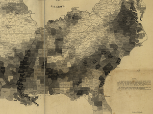 So it was a neat coincidence to run across Susan Schulten’s insightful blog post about the 1861 map of the Slave Population of the Southern States. Part of a series of posts on the unfolding of the Civil War hosted by the New York Times, Schulten’s short essay shows how this single map became a political, social, and military force. Combining census data, geographical surveys, and statistical analysis, the map is a fantastic early example of GIS technology. Lincoln was fascinated with the map, a high resolution copy of which is available courtesy of the Library of Congress, and poured over it in the waning years of the Civil War.
Despite its special role in the history of the Civil War, the 1861 census map was hardly the first to chart the slave population, as well as the growing sectional consciousness, of the United States. Reynolds’s Political Map of the United States drew on the census of 1850 to compare “the principle statistics of the free and slave states” and was used as a propaganda tool by the nascent Republican Party in the election of 1856. This map also featured general statistics on slave ownership and the disproportionate influence of the Slave Power in government (the slave-holding states were colored dark black, a not-so-subtle commentary on their moral and economic standing). Earlier still was Lewis’ Free Soil, Slavery, and Territorial Map of the United States, published in 1848 (copy available courtesy of Yale’s Map Department). Again, the slave states are painted a dark black and lengthy statistical analysis is employed to mobilize opinion against the Slave Power. In some ways, the Lewis and Reynolds maps are actually more revealing than the 1861 census map, because they focus attention on the uncertain fate of the western territories (a geographic area larger than both free and slave states combined). Certainly both maps were direct models for the more famous 1861 incarnation.
Schulten, an expert on the history of mapping, detailed the statistical and cartographic antecedents for the 1861 census map in a brilliant article in the journal Civil War History. Oddly, it is not cited or even mentioned in her NY Times post. Perhaps the editors thought it was too “scholarly” for a general audience? (I thought it was a damn good read.) In this longer piece, Schulten argues that the widespread use of statistical maps for policy ends was directly stimulated by the antebellum slavery crisis. And, along the way, she makes a convincing case for the role of mapping systems as both reflections of broader historical shifts and key political-historical forces in their own right. This is an insight worth keeping in mind as we barrel head-on through the GIS revolution.