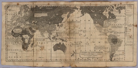
 Nineteenth-century Americans viewed themselves through an international lens. Among the most important artifacts of this global consciousness is William Channing Woodbridge’s “Moral and Political Chart of the Inhabited World.” First published in 1821 and reproduced in various shapes and sizes in the decades prior to the Civil War, Woodbridge’s chart was a central and popular component of classroom instruction. I use it in my research and teaching. It forms a key part of my argument about the abolitionist encounter with Africa. And every time I look at it, I see something new or unexpected.
Like basketball and jazz, the moral chart is an innovation unique to the United States. The earliest iterations depart from the Eurocentric and Atlantic focus with which modern readers are most familiar. Reflecting the early American obsession with westward expansion, they gaze out over the Pacific Ocean to East Asia and the Polynesian Islands. The chart features a plethora of statistical and critical data. Nations and territories are ranked according to their “Degrees of Civilisation,” form of government, and religion. Darker colored regions are “savage” or “barbarous” while rays of bright light pour out from the Eastern United States and Northern Europe.
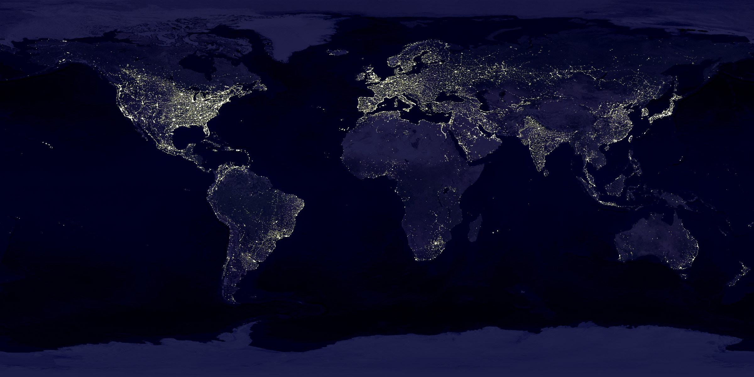
Thematic mapping of this sort was nothing radically new. John Wyld’s “Chart of the World Shewing the Religion, Population and Civilization of Each Country,” published in London in 1815, graded national groups on a progressive scale, from I to V. Wyld gave himself a V and the United States a I, II, and IV. Woodbridge may have been inspired by this example, but he also took it to a new level. Drawing on the climatological charts developed by German explorer Alexander von Humboldt, he used complex shading and mathematical coordinates to give an air of scientific precision. And he placed the United States on a civilized par with Europe. With its sophisticated detail and colorful imagery, it is easy to see why Woodbridge’s image became a runaway success. It is deeply disturbing to compare it to recent NASA maps of the global electrical grid.
Countless men and women stared at similar maps and reports from foreign lands and dreamed and imagined and schemed about their futures. Some experienced dramatic revelations. Visiting friends in 1837, itinerant minister Zilpha Elaw heard the voice of God: “I have a message for her to go with upon the high seas and she will go.” Others were simply bored. Prior to his arrival in Monrovia that same year, medical student David Francis Bacon daydreamed about Africa, “torrid, pestilential, savage, mysterious.” George Thompson, a prisoner in Missouri in the 1840s, read articles from the Union Missionary aloud to his fellow inmates. “We quickly pass from Mendi to Guinea, Gaboon, Natal, Ceylon, Bombay, Madura, Siam, China, Palestine, Turkey, The Islands, the Rocky Mountains, Red Lake,” he wrote in his journal, “from tribe to tribe – from nation to nation – from continent to continent, and round the world we go.”
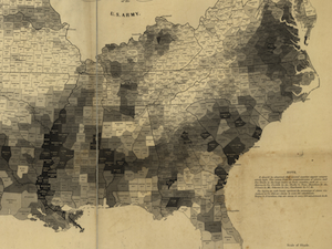
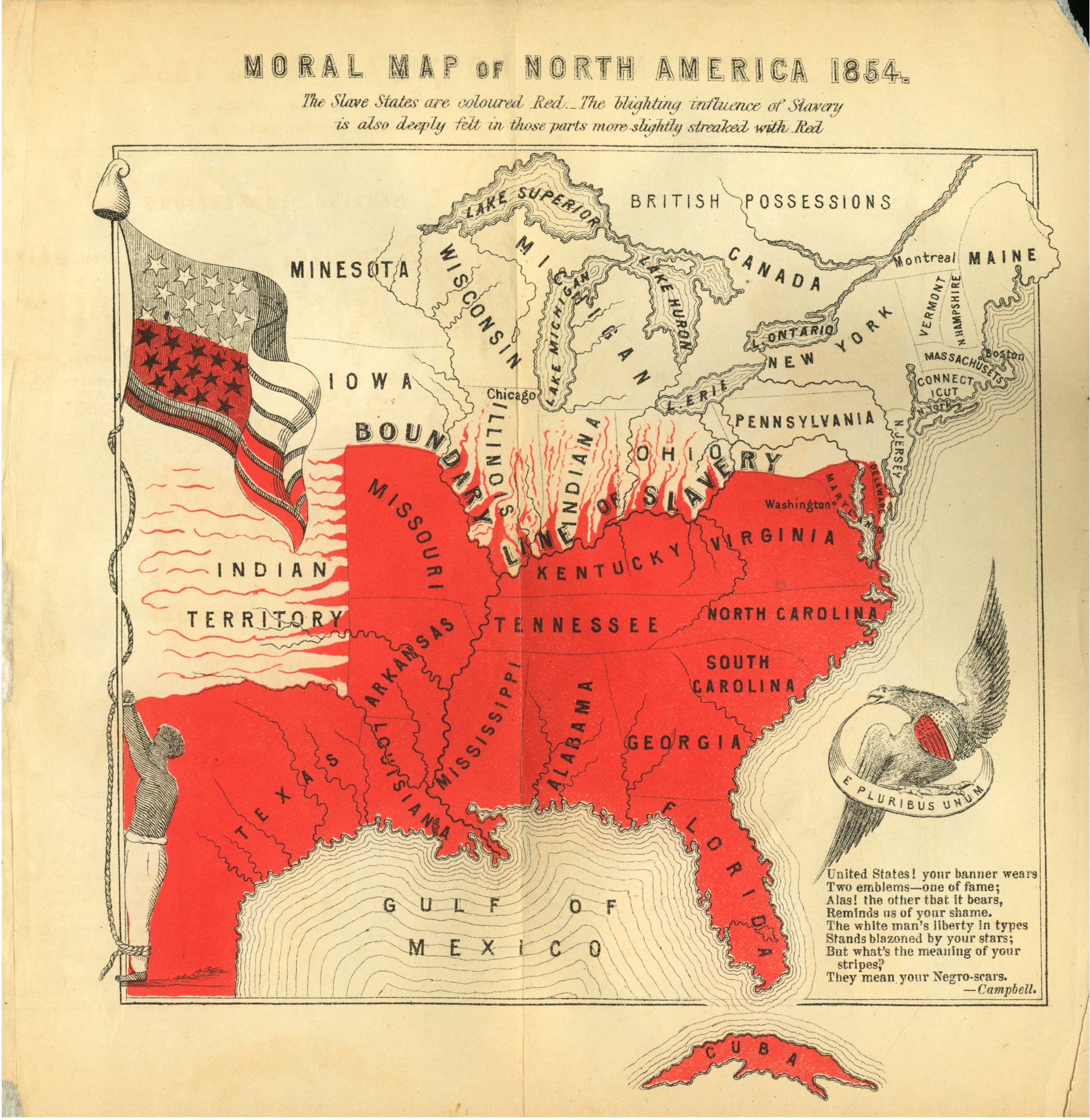
Woodbridge’s chart and others like it inspired a slew of “moral maps” illustrated by antislavery activists, in which the slave states were usually colored the darkest black. One of the most explicit, published by British ophthalmologist John Bishop Estlin, used blood red to symbolize the “blighting influence” of the South oozing out into the rest of the country. An 1848 broadside showed slavery poised to swallow the entire hemisphere, from Cuba to Central America to the Pacific Rim. Another used a black arrow to trace the “curse of slavery” from Virginia to war, treason, murder, and hell (which is located in Texas). The most famous of the Woodbridge descendants were the elaborate “free soil” charts and diagrams used in electoral campaigns. Crammed with statistics correlating slaveholding with illiteracy and political tyranny, these charts became crucial organizing tools both before and during the Civil War.
The most unusual map I unearthed in the course of my research reversed the logic of the typical moral chart by shining a bright light on the African continent. Published by the American Anti-Slavery Society in 1842 and reprinted many times thereafter, this map reveals the movement’s Afrocentric global vision. Europe and North America recede into darkness as Africa takes center stage. The United States, flanked by the term SLAVERY, is almost falling off the map at the edge of the world. Most editions coupled this image 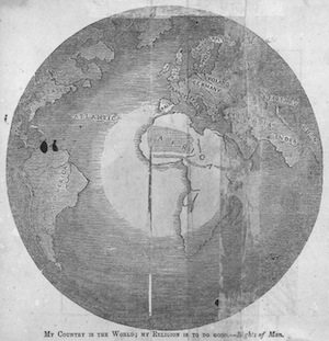 with a moral map of the U.S. South, which colored the slaveholding states, and even the waterways surrounding them, as darkly savage, the lowest of the low on the Woodbridge scale. The juxtaposition of these two images significantly complicates historians’ assumptions about Africa as “the dark continent.” Although we now know that the human race, language, culture, and civilization all began in Africa, such views were not uncommon in the middle decades of the nineteenth century. Contemporary ideas about African cultures were complex and often mixed condescension with respect. Most surprising of all, I know of no historian who has given sustained attention to this map. With the exception of outstanding books by Martin Brückner and Susan Schulten, I know of few historians who have engaged the legacies of William Woodbridge’s various moral charts.
The past five or ten years have witnessed an explosion of scholarship on the global dimensions of American history and the birth of a new field, sometimes referred to as “The United States in the World.” Nineteenth-century history is very much a part of this trend, but progress has been slow and uneven. The nineteenth century was America’s nationalist century, with the Civil War serving as its fulcrum in both classrooms and books. Perhaps understandably, there is a tendency to look inward during times of national crisis. Yet as I and others have argued, nationalism – and racism, and sexism, and classism, and other related isms – are a fundamentally international process. Woodbridge’s Moral and Political Chart is the perfect example. Simultaneously nationalist and international, it depicts the United States embedded in a world of turmoil and change. Two recent conferences in South Carolina and Germany are evidence of a rising momentum that seeks to re-situate the U.S. Civil War era as part of a much broader global conflict. But a great deal of work remains to be done.
To get a sense of where the field is heading, its strengths as well as its weaknesses, it is necessary to map the terrain. To my knowledge, no one has attempted an organized and comprehensive database of the rapidly growing literature on the international dimensions of nineteenth-century American history. So, not too long ago, I launched a Zotero library to see what could be done. Based on the bibliography for my dissertation, it is decidedly biased and impressionistic. Aside from brilliant entries by Gerald Horne and Robert Rosenstone, the Pacific World and Asia are underrepresented. The same could be said for Mexico and the rest of Latin America. Since the nineteenth-century, like all historical periods, is essentially an ideological construction, I have been flexible with the dates. I think anything from the early national period (circa 1783) through the entry into World War I (circa 1917) should be fair game. Although he is not chiefly concerned with the United States, this roughly corresponds to the limits set a decade ago by C. A. Bayly. I also subdivided the material based on publication medium (book, chapter, article, dissertation, etc.). This system can and probably should be refined in the future to allow sorting by geographic focus and time frame.
Zotero is admired by researchers and teachers alike. Over the past seven years, it has evolved a robust set of features, including the ability to collaborate on group projects. The Zotpress plugin, which generates custom citations for blog posts, is another really neat feature. As a content management system, it still has its flaws. The web interface can be sluggish for lower bandwidth users, and compared to Drupal or Omeka, the member roles and permissions are downright archaic. If an admin wants a user to be able to create content but not edit or delete other users’ content, for example, there is no real solution. Admins are able to close membership, so that users must request an invitation to join the group. This allows tight control over the content community. But it arguably kills a good deal of the spontaneity and anonymity that energizes the most successful crowdsourcing experiments. At the same time, the Zotero API and its various branches are fully open source and customizable, so I really can’t complain.
The biggest problem is the randomness of the semantic web. Primarily a browser plugin, Zotero allows users to surf to a site, book, or journal article and add that item to their bibliography with a single click. Sites do not always have the best metadata, however, so manual fixes are usually required. Several of the books I added from Google Books had an incorrect publication date. Others had very little or no descriptive data at all. Without delving into complicated debates about GRDDL or Dublin Core, I will just say that a catalog is only as good as its metadata. None of this has anything to do with Zotero, of course, which still gives the 3×5 index card a run for its money.
Although I admit I am not a heavy user, Zotero struck me as the ideal platform for an historiographical potluck. My Nineteenth-Century U.S. History in International Perspective group is now live. Anyone can view the library, and anyone who signs on as a member can add and edit information (I just ask that members not delete others’ content or make major changes without consulting the group). As of right now, I have not added any substantive notes to the source material. But it might be neat to do this and compile the database as an annotated bibliography. I will try to update the library as I’m able. At the very least, it will be an interesting experiment. A large part of the battle for history is just knowing what material is out there.
Cross-posted at The Historical Society